Monday, September 27, 2010

Assignment 4

Hello world!
Okay, this is gonna be an image heavy post.

Recess week.. wasn't very recess-y =(
Spent all week either in doing work or out having project meeting or filming.. As a result, recess week was more busy than the regular week! Zzz. Oh well.

But that meant that I had alot of time to spend working on Assignment 4!
I actually borrowed a pen tablet, because I was ambitious because I originally wanted to just do a piece of digital art instead, since I felt bad having to make a friend look ugly =/ more on that later..

Okay, here are some initial draft pictures.. I did 3 rough layout sketches:

This shows the first 2 drafts I drew up. The first idea I had was to have a photo of a girl sitting up in bed, in the dark probably, with a red lamp, Chinatown-style. I liked the idea of having the color red being prominent, as it's the main color in the aids awareness campaigns worldwide, so red in itself would hold much meaning. Anyway - that idea wouldn't really work, because I would a) need a good camera for that and b) I would need to find a really nice-looking room, plus props like a red lamp (where to find a red lamp!??) which would be difficult.

The second draft is more like a beauty/commercial advertisement - only, of course, it really isn't an ad about beauty. So this idea would be more of a sly thing - the viewer is hopefully tricked into thinking the ad's about beauty or fashion or something, and upon closer inspection.. ew what's that ugly rash! OMG! HAHA.

I was also pretty fascinated by Picasso's drawing of someone's butt. And the mathematics behind 4 lines! Kinda drew inspiration from that for this draft, and positioned my model in what I personally perceive to be an intriguing angle.. and also where part of her face is hidden from view, so you can't really see what she's expressing?

Sketch 3.. Kinda r(a) eh. Hahaha. Obviously wouldn't be able to find model for this ah, and I doubt I can draw something epic like this, soooo. SCRAPPED. LOL.

Yep, so. I decided on Sketch 2, though I liked sketch 1, it would be not very practical, props wise. Sketch 2 was more feasible, and it being simple, I could add more touches to bring my message across.

So. Me being me, and me being overly ambitious, wanted to try going digital for this assignment. I wanted to digitally paint a chio bu like this one with the pen tablet I borrowed. And I tried! I really did.. How many different images I tried. Here are some snapshots-


Decided to play on the curves more, and crossed arms would play curves down.. But this girl was way too white, and I kinda screwed up her face. LOL and I suck at drawing lines, though I can do curves well. Hence her arm looks damn scarecrow lah!

Several new images later, I came up with this! I kinda liked this one.. I put more detail into her face!

I wish I looked like that. LOL.
Anyway, I kinda scrapped this. Because the hair was looking weird, and while I had a general idea on how to make the painting look more realistic, it was not practical. It would take me DAYS, maybe WEEKS to complete. What you see above took me a few days to get to the final shot - and it's barely complete. ZzZ. Out of interest though, I'll continue working on the painting to see what I can come up with.. and if its good I'll post it up here (;


ANYWAY.
After giving up on digital painting, I decided to convince my friend to pose for my assignment for me. (I felt bad initially since we had to make it ugly - but after the rules were lifted about the ugly requirement, I began to picture a not so ugly poster.. and a rather pretty one, so I didn't feel that bad anymore wahahaha.)

So here's some initial shots I took.. bad lighting, little makeup, and her dog frantically barking at me in the background =/

I decided to use the last photo (right photo from the second picture) as the one for the poster.. Which took me a few days to photoshop nicely!! I photoshopped my friend's skin and makeup and hair and clothes. HAHAHAHA. Does it still look like her?

Well alot of hard work okay! wahahha.
And the end result..

Please click for a bigger picture.

Yeah! Phew. I really like my poster, actually.. this is the first assignment for which I really liked the outcome. :)) Thank you to NYP for drilling so much print ad practice into me.. :))

I managed to more or less fulfill some things I set out to do - firstly to not make the 'ugly' or 'fearsome' rashes the focus of the picture, to make it a little more subtle, to catch attention with the color scheme, and to draw initial attention to the top of the picture, to the header that says 'Beauty'. I wanted the viewer to first, read the header, then down to the rest of the tagline, and then shift left to realise that the girl has rashes on her arms.. on her chest, and omg, around her mouth, too??? Hahaha. =x And then, now curious, back down to the rest of the copy.

My tagline is 'Beauty is only skin deep'. This works twofold:
1) Beauty is skin deep - you'll lose your beauty and control over your appearance with AIDS. You may have beauty but with AIDS you can't cover it once it sets in (we see my model having hair draped over a shoulder, *attempting* to cover some rashes, which are photoshopped on btw)
2) beauty is skin deep, and you can't see what lies beneath - you don't know if the person you're with has AIDS or not, since the symptoms are hardly as obvious as that which you see on the poster, so be safe!

Yep. I tried to cover these points in the minimalist copy I have.. not too much text as I don't want it too cluttered.


Other things to note:
- the color scheme is red and white as much as possible, notwithstanding skin color and hair and text etc of course, but the main colors are red and white.. So, I also changed the HPB logo to red.. which I was told is not allowed, lol. So need to redo that bit.. =)
- the red ribbon I placed on her spaghetti strap! Hahaah. I didn't want to place it at the bottom or anywhere else, so normal.. So I thought it'd be nifty to have it there, and class critique didn't have anything negative to say about it, so I guess it's fine to leave it there.
- the font! I wanted to use a font that would connote certain feelings, or rather, make the viewer relate to a certain type of poster.. which would specifically be fashion posters or print ads, beauty ads, which use these san serif/serif font hybrids. Which Miss Siti did notice in class, I'm glad. =D
- the word 'beauty' my classmate told me that it looked a little weird leh, floating.. I'll relook into how I can play around with the placement of the text :D will try to have it aligned like it currently is, though, so it looks neater.. xD


Okie, til next time! Phew long entry!!! :)

Thursday, September 16, 2010

Assignment 3


Yep, that's my 8 photos for the exercise! Hmmm.. Did you get it? =D
So basically it goes like this:
  1. Girl's reading a book.
  2. Girl's tired, gets ready to sleep.
  3. A hand creeps in and turns off the light...
  4. Sees an odd figure silhouetted in the doorway
  5. Girl's curious, surprised, looks at the silhouette
  6. Silhouette extends its arms, looks pretty scary
  7. Girl's freaked out!
  8. Lights back on! Silhouette is actually the girl's sister, bearing friendly gifts of blankets and a bolster. ^^
Yeah! Simple storyline, I'd say =)
Some things I took into consideration:
  1. I really wanted a horror storybook for this shot. BUT after much rummaging around, I realized that I don't possess a single horror storybook =.= The book in the shot is the next best thing, as it has a silhouette on its cover - which foreshadows the issue with the silhouette in the coming shots. Also, the girl is captured in a low angle shot to make her look like she's in control of the situation..when really later she feels pretty helpless.
  2. Horizontal lines in both body posture and bedsheets - relaxed cos she's going to bed
  3. Extreme close up of the hands. Rusty color of the shot and the shabby looking switches gives off a horror movie vibe.. (to me anyway.. lol)
  4. Low angle shot to make the figure look intimidating and powerful
  5. Extreme close up to show emotion
  6. Again, another low angle shot to create a sense of fearsomeness
  7. Another extreme close up.. My sister is a pretty bad actor, so.. I kinda photoshopped her eyes and mouth to make them look bigger, like as if she is in shock/fear.. lol!
  8. Eye level shot.. To express a non-threat, to eliminate the initial intimidation and power distance.

Yeah, I know the quality of the shots are pretty terrible - forgive me on that, my shaky hands took them on my 5megapixel handphone cam ><" and my phone's flash is REALLY bright, so I had to make do for no flash with most shots.. LOL. And the storyline's pretty simple too.. hahaha.

What do you guys think?

Wednesday, September 15, 2010

HMM

Are we supposed to post Assignment 3's photos up yet?
Hmm. Well I will post them up tomorrow, anyway. =)

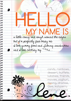
Introduction to MEEEE :D

So I was sick during the first lecture (I have an MC to prove it!! haha.)
And I missed this exercise, which seemed really fun. Instead of drawing it out though, I thought it'd be more fun if I did it with Photoshop.. I'm not really perfect with Photoshop yet, and I tendddd to 画蛇添足 (which means to add more details than I really should.) Hurhur..

But that being said I'm pretty familiar with Photoshop and I loveee playing around with it. Hehe.

So here's what I came up with that weekend! =)

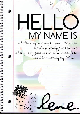
I kinda liked this version! But, after showing it a friend and after some critique I thinkkk I committed my deadly sin again =/ So I shaved off some 'unnecessary' details, and came up with this:

Yeah, this one looks tons better after scrapping certain stuff :D
And I'd likeeee to say that I drew all those pretty flowers and kites etc, but nah, these were brushes - but things like color and details like joining the flowers to my name were done by me, so, yeah.. I'd love to be able to draw stuff like this one day! =)

So, I guess you can garner what I like and what I am would like to be about?
Colors, pretty flowers, seemingly deep poetry about sandwiches.. And most importantly, CG design! =) for this picture I still relied on my own brushes and stuff, but by the end of the module I hope to be able to create awesome pictures with my own bare hands (and computer) hehehe!

I hope my poster got your attention! (;

Indexic.. Iconic..

During lecture we had to do this impromptu sketch for an Iconic and Indexic symbol! So I was sitting with Caris, and she came up with the idea of a clock, and I sketched it out.. And the indexic image would of course be time hands, which would connote that the viewer is looking at an item which tells time.

Well, this is pretty obviously a clock.. Pretty medieval looking, too..

On contrary, most contemporary clocks are designed such that most details are omitted - leaving only time hands, or digital number displays. Which would imply that most of its design is no longer iconic, but indexic, in a sense? Would it be right to say that? Hmm.

And it's funny that Caris suggested clocks, 'cos I've always been really fascinated by pretty clocks..

Take a look at these! I'd loveeee the wooden clock!!


And our prof for NM2216 was showing us an example of a really cool alarm clock that allows you to update your social networking profiles:

The Sony Dash: find out more about it here

But it's so cool! Although I wouldn't like to be thaaat attached to my technology and social networking sites.

Okay, probably veering a littleeee off topic, but my point is that once upon a time clocks were.. simply clocks, and nothing much was done imaginatively to bring the design of a clock into something more special. Just goes to show that even the most mundane of things can be turned into a work of art, and even the most iconic of figures can be turned into something abstract and mindblowing! =)

Welcome to Pawsh!

This is my (updated) company profile! Previously, I'd decided on a simple pet store.. But I've decided to take it up a notch. Below's my company profile! Stay tuned for future posts to check out my new and improved biz logos! :D


COMPANY PROFILE

Pawsh (pronounced Posh, and short for ‘Paws House’) is a dog service centre located in Serangoon North’s famed pet hub. As a one-stop dog-lovers’ retreat, we pride ourselves with our wide array of pet accessories, clothes, dog food, and of course, lovely puppies for sale. We also offer comprehensive grooming services, and obedience training lessons (conducted outdoors) for dog owners. But we are not just your ordinary pet store – Pawsh also is a café for dogs and dog lovers alike, for humans and canines to enjoy the one thing both species love – food. After a visit to the nearby vet, or shopping for clothes for your furry friend, why not sit down together and bond over a meal? On the menu we have set meals for owners and their pets, with delectable delights such as pasta, pizza, and steak (all of which are dog-friendly, of course!) Alternatively, have your pups mingle with other dogs at our Pawsh Pup Playground, while you mingle with other dog lovers at our café or browse our store. We are also open for bookings for pet birthdays, themed parties, or simple gatherings with fellow dog lovers.

Assignment 2

Okay, I have to start off by saying that I'm really not pleased with these results either. :( More touchups/redo-ing to come.

But let me show you what I came up with though.. Hopefully I can get more constructive critique on this!! :)

So here's the five levels of abstraction (please click for a bigger picture). I pulled a picture of a Dalmatian off the web. Why a Dalmatian? Because its physical and muscular makeup seem most generic, where dogs are concerned, IMHO..


I really only like the first 2 levels of abstraction, and this one:

But after that, I don't know. I think more needs to be done. Or perhaps I should change the picture I used as a base? I had trouble abstracting such a picture that was generic in itself. Perhaps that was the problem.. If I were to change the base picture, I may use a more 'interesting' doggie as my muse.. HMM.

Here's the business card(s) that I came up with! Two here, because I could not decide which was better (or worse :/) OH MAN.

The first is the one I prefer, though I know the second one is probably more simple and hence easier for the eyes. The first one I feel is more apt for my proposed business, though. Critique given was that the black fill for the dog head, for the first card, is kinda out of place, and also that the logo needs to be cleaned up lines wise - which I completely agree. I'm currently looking at Illustrator tutorials on how to make cleaner lines. So a better logo will be up soon!


/Edit: I just took out the company profile and put it in a separate post. Reason being I've tweaked my company profile.. And it probably doesn't quite click with the biz card abstracts uploaded here so. Am going to tweak my biz cards and upload them in the next few days! =)

Tuesday, September 7, 2010

Assignment 1B

Had this uploaded in draft but never got around to posting it. I'll post them assignment by assignment I guess.. =)

So here's the second part of Assignment 1.. I guess the main challenges I found was finding my way around Illustrator. I'm pretty experienced with Photoshop, but Illustrator was a different ball game altogether, I still have trouble figuring out how to use a brush in Illustrator, lol. But I spoke to my friends in the design field, and I've seen stuff that they've whipped out using Illustrator - amazing stuff. Hopefully one day, with enough practice, I can be as versatile with Illustrator!

So anyway! Here's the final two that made it to Illustrator!

The first's a tidied up version of my 'I like food (pasta)' theme. I was thinking of adding a setting, perhaps a plaid tablecloth, to give it a restaurant/cafe feel. But I'm not too sure how to create a pattern like that for now.. hmm.


The second one's the final theme for 'I like dogs'! I really like this one, I find my dogs pretty cute *chuckles*


But comments I got from the class were that the L and first E are not pronounced enough. So there's some tweaking that I will still have to do. I also tried playing with a setting. I added some grass. But it looked pretty awful, so I stuck with a simple wave line.. As with the pasta art, I will have to work on a background/setting to make the pictures look better.. So stay tuned til touch-ups are done! :))

Assignment 1A

Hello!

This is Lene, reporting in with a very belated update on Assignment 1 :)
So, I took a really long time to decide on the topics to do on. I shortlisted them to perfumes, dogs, food, and shopping.

I drafted out some perfumes. But it was tough because I'd have to confine the letters to the shape of the bottles. And bottles being bottles.. well, can't really be very bendy. Haha! So I scrapped that, although perfumes was my favorite topic. But likewise in a real world context, you can't always do what you like, you have to work according to the guidelines given to you.

Topic 2 that i'd shortlisted was shopping. I really liked shopping. But not as much as I liked dogs or food. Hahaha. So I went straight into doodling dogs and food.

Here are my thumbnails for food:

From top to bottom: fast food / pasta / cakes / breakfast.

Food was a little tricky, cos I wasn't sure if I was to stick to a particular kind of food, or mess around with all kinds of edible items. I did the latter - though each thumbnail sketch had a particular theme, as mentioned above. I really liked the breakfast and pasta themes..


So. The other topic! DOGS! I love animals, and I loveee dogs so much. I used to have one, but it passed away due to health complications when I was in secondary school. I've been lusting for a dog for so long, but my mother refuses to let me have another. :( ANYWAY! I did a couple of thumbnails for this topic:

First thumbnail shows a couple of dogs in different positions.. Second has a small story to it, where a mischievous dog knocks over his food and water, and causes a mess! Hehe. I thought that one was pretty cute. The third's a small narrative as well, kinda.. A dog's out for a walk in the park, gets tied to a (typical dog scene item) fire hydrant. And the fourth, well.. I don't know if it makes sense here, but it shows two dog owners getting acquainted through their dogs.. =)


So I had to pick a couple of thumbnails and work on rough sketches with that. So here's 2 sketches for my Food - Pasta topic!
Yeah, I couldn't think of what else to form the 'N'. LOL!

I'm not too sure whether the spaghetti strands count as deliberate or smokes? =/ But I like the 'N' in this one, though.


And here's the rough sketches for my dogs!

This one is pretty much the same as the thumbnails, with a few added details and some changes in the stance, especially with the last E, to make it look a little more natural.

This is probably one of my favorites - because the dogs look so happy! hahaha. But yeah, this one's probably gonna be in a setting, park setting probably. This sketch shows dogs playing outdoors. Feedback I got was that the second 'E' or the frisbee was a little weird, looked like a Pacman figure! Haha. I've got to work on that..


Okay! That's all for Assignment 1A. Will upload more in the next post =)
Comment, please! Muchos thanks..

Friday, September 3, 2010

First time for everything

Hello! This is Cherylene, I'm a year 2 NM major, and this is my NM2208 blog.. in which you'll see the doodles assignments I've done up!

Will post my assignments up tomorrow! :))